10+Draggable Frames
C++Language
TGEEngine
LiveEdit Mode
2026Year
Overview
I built a fully custom, player-configurable HUD system from scratch in C++ using the school's custom game engine (TGE). The system allows players to enter an edit mode and freely drag, resize, and toggle every UI element — player frame, target frame, party frames, buff/debuff frames, action bars, cast bar, and stance bar. Inspired by World of Warcraft's addon system, every frame is a movable object with real-time snap-to-grid and snap-to-element behaviour.
My Role & Responsibilities
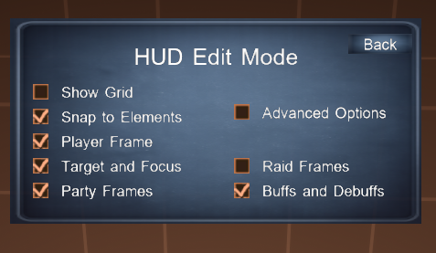
I designed and implemented the entire HUD system solo — from the base Button/Frame architecture and drag-drop system, through to every individual UI widget. I built the edit mode panel with its checkbox settings, grid slider, and advanced options toggle. I also implemented the spellbook, action bar per-slot settings popups, party frame configuration, and the spell tooltip system.
HUD / UI SystemsDrag & DropEdit Mode
Action BarsBuff / Debuff SystemCast Bar
Party FramesSpell TooltipC++TGE
Technical Highlights
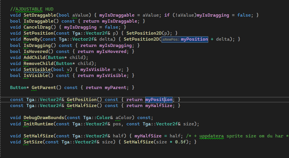
Every HUD element inherits from a shared Button base class that handles dragging, visibility, camera binding, and input registration — meaning adding a new movable frame takes minimal code. The edit mode uses a grid snap system with a configurable grid size (25–200px), and an element snap system that detects nearby frame edges and snaps to them automatically. The buff/debuff overlap resolver detects collisions between the buff and debuff frames and pushes them apart using the minimum displacement direction — preventing z-fighting and visual overlap without any manual positioning from the player.
Development Breakdown
Step 01 — Normal View
A Complete In-Game HUD
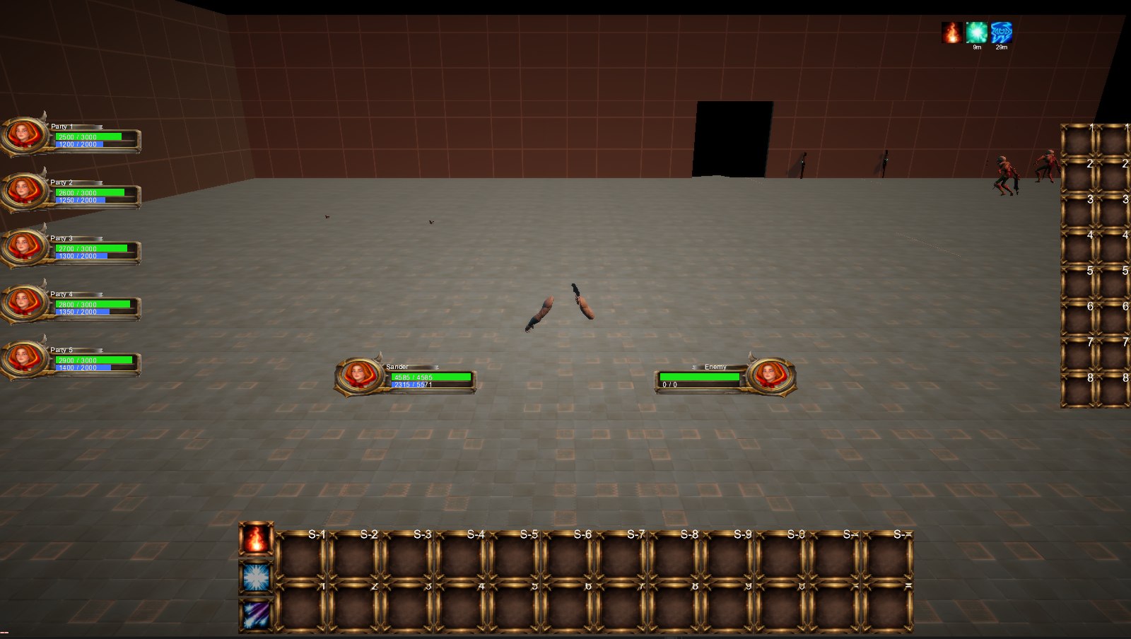
The normal gameplay view shows the full HUD in action — player and target unit frames with portraits, HP and mana bars, five party frames, two action bars with spell icons and cooldown timers, buff icons with duration countdowns, and a cast bar.
Step 02 — Edit Mode
Live Grid, Draggable Frames & Debug Bounds
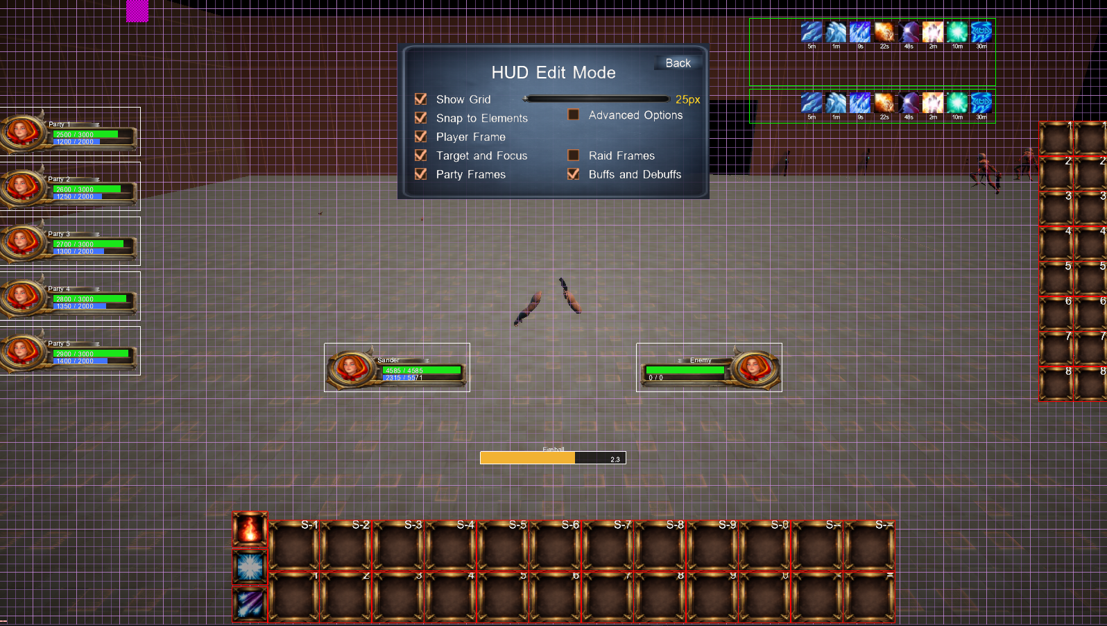
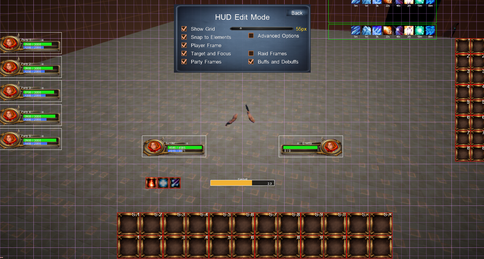
Pressing the edit mode toggle overlays a purple grid across the screen and draws debug bounding boxes around every HUD element. All frames become draggable — snap-to-grid keeps them aligned, and snap-to-elements lets frames lock to each other's edges.
Step 03 — Advanced Options
Two-Mode Settings Panel
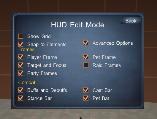
The HUD Edit Panel has two modes — compact and advanced. In compact mode it shows the most common toggles. Enabling Advanced Options expands the panel and reveals extra sections: Frames (Pet Frame, Raid Frames) and Combat (Cast Bar, Stance Bar, Pet Bar).
Step 04 — Button Base Class
Shared Architecture for Every HUD Element
Every HUD element inherits from a single Button base class. It handles dragging, hover detection, child propagation, visibility, camera binding, and debug rendering. Adding a new movable frame takes almost no boilerplate code.
Step 05 — Child Propagation
Move Propagates to All Children
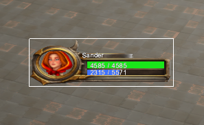
When a frame moves, SetPosition2D calculates the delta and calls PropagateMoveToChildren — which recursively repositions every child without touching their text layers. A player frame dragged in edit mode automatically carries its portrait, bars, and name text together as one unit.
Step 06 — Drag & Drop
Grab-Point-Accurate Dragging
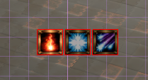
When a draggable frame receives a left-click while hovered, it enters drag mode and stores the cursor offset from the frame centre. Every subsequent hover event moves the frame to cursor minus offset — giving smooth, grab-point-accurate dragging regardless of where you click the frame.
Step 07 — Grid Snap
Configurable Snap-to-Grid System
When snap-to-grid is enabled, every slot position is rounded to the nearest grid cell before being applied. The grid size is configurable via a live slider (25–200px, snaps to 5px increments). A single ApplySnap function handles all the rounding math.
Step 08 — Action Bar Editor
Per-Bar Layout Control
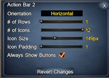
Each action bar has its own edit popup — orientation, number of rows, number of icons, icon size, icon padding, and an "Always Show Buttons" toggle. Changes apply immediately. Bars can be dragged freely in edit mode and snap to each other.
Step 09 — Spellbook & Tooltips
Spell Assignment & Rich Tooltips
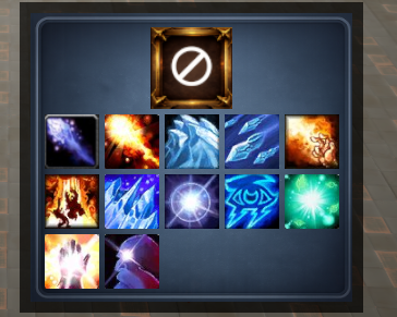
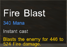
Clicking an empty action bar slot opens the spellbook popup showing all available spells as icon buttons. Hovering a filled slot shows a rich tooltip: spell name, mana cost, cast time (or "Instant cast"), and a damage description. Spells have cooldowns, cast times, and trigger buffs/debuffs on the HUD when used.
Feature Showcase
Normal View
Edit Mode
Advanced Options
Normal Options
Button Base Class
Spellbook
Spell Tooltip
Action Bar Editor
Grid Snap
Grab-Point
Move Propagation
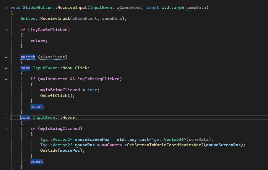
Drag & Drop